Wednesday 25 May 2011

New and improved Page Animations Website

Yes, my new website is now up and running. It’s taken a lot longer than I would have liked but I have had to fit it in between other projects so when I look at it like that it’s okay. Please go have a look at www.page-animations.com.

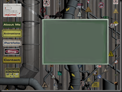
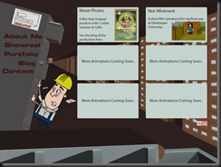
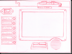
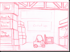
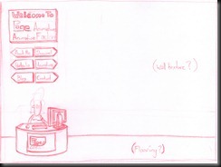
I thought I’d share some pictures of the stages I went through to create each page. On a few of the pages I was able to go straight from the rough idea sketch into the final look of the page and others I created a basic CG mock up of the 3d space so I could really get the perspective looking right. For all of them though I did lots of thumbnails to get the layouts working and went through tons of character designs for the Worker, Receptionist and the Ideas Monkey.


ReceptionRoughReceptionFinalAboutMeRoughAboutMeFinalShowreelRoughShowreelCGShowreelFinalAnimationsRoughAnimationsCGAnimationsFinalAnimViewerRoughAnimViewerFinalContactRoughContactCGContactFinal

Thursday 10 February 2011

Sheep Speed

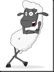
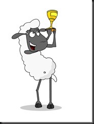
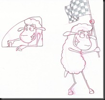
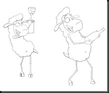
I’ve been working on a couple of projects recently one of which is for a racing team designing their mascot type character. I had to design a sheep character for their racing team ‘Sheep Speed’. They are going to be using it for their website and printing it off in vinyl to put it on their cars. Hopefully I’ll get some pictures of the designs once they’ve been added to the cars. Here are the designs I did as well as the final vector images.

SheepCarSheepFlagSheepHelmetSheepLean01SheepLean02SheepSpraySheepTrophy

FinalSheepPoses02FinalSheepPoses04SheepPoses03FinalSheepPoses01

Sunday 28 November 2010

RedDog Badge and Animation

A Little while ago I designed and animated the RedDod logo. Since then I have been asked to design the badge to go on their football shirts and also to do an animation for it as well.

This is the badge design which incorporates the dog image from the initial logo design.

RedDogBadgeFinal

I then used this to model the badge in Maya making it a three dimensional object and animated it spinning, this is the result.

Friday 19 November 2010

Call Centre Awards Comic Strips

A friend of mine asked me if I could produce some comic strips for her. They were to be attached with an application for a call centre awards event that is held annually. I was really pleased to hear that she has been nominated for the award and she has asked me to attend the event with her early next year. I’ve now got to make sure my suit still fits me!

Here are the strips that I did with the application.

Marathon

Bubbly

Calls

Impact

Thursday 18 November 2010

Moon Pirates Storyboards

Two years ago I was part of the Cyfle Animation course which ran for three months. We had to produce a two minuet animation. My good friend Alyn was the Director as he came up with the initial concept for Moon Pirates then the rest of us helped to develop the story and produced the animation. I was sorting through some files on my computer when I came across the storyboards that I did for this project and realised I hadn’t ever put them up anywhere. So here they are, though as the comments, notes and dialogue aren’t attached I don’t know if you’ll be able to make much sense of the story, plus the fact this is right in the middle section of the film.

MoonPiratesSB01

MoonPiratesSB02

MoonPiratesSB03

Peter Vs. Robot Boy Comic

I was recently asked by a colleague to do a comic strip for their son as a birthday gift. I was given a few ideas to play around with but when I was told that his nickname was Robot Boy I came up with this Godzilla inspired giant robot fight. I was thrilled to find out that her son loved it and they have printed it out as a large poster which he now hangs on his wall. Come to think of it I’d love a poster of me fighting a giant robot on my wall.

PeterVsRobotBoyComic

Sunday 2 May 2010

Red Dog Entertainment Logo

I have just finished a logo design for a colleague at work. He gave me a very basic design which I drew up and vectorised in Illustrator. I hadn’t used Illustrator a great deal before but I really like it. I’m still very used to the way that Flash draws so it took a little getting used to. I absolutely love the colour guide feature in it and really wish Flash and Photoshop had that feature too. Anyway, the logo is for a company that organises 5 a side football leagues with cash prizes. I did a small animation for the logo as well.

Web

Wednesday 9 September 2009

Her Morning Elegance / Oren Lavie

I was reading Jason Schleifer's blog and came across this link to one of the most creative and impressive music videos I have seen in a long time. Great use of stop motion animation. I can't say I love the song that much but I do love the visuals, especially the second verse where she falls into the water. Have a look and let me know if you know of any other interesting music videos out there.

Thursday 13 August 2009

2 Bee Games Comp

2 Bee Games Are currently doing a competition with a different theme each week for 8 weeks. It is all for pixel art and week 2 had the theme of 'The Villain' so I thought I'd have a go at some pixel art in paint. You had to come up with a name and a back story for your character, so this was my entry:

Evil Ed the Undead Doomsday Head.

Ed used to work at a retail shoe shop till he had an unfortunate accident involving a stiletto contaminated with a mild strain of a zombie virus that left him without an eye. The virus spread slowly and over time he gradually lost more limbs. Before they all fell off Ed travelled to Taiwan and acquired the necessary parts to build a machine that would carry what was left of his body. So using only his tongue and the three remaining toes he had left, Ed built the robotic/mechanical devise that he now uses. Due to an inability to use his TV remote to change the channel on his TV to a station that doesn't continuously play re-runs of shows he has already seen and the fact that he can no longer cuddle his pet cat Toby, he has become increasingly bitter. Because of this he has become the evil and twisted villain we all know today!

Trex

It's been a while since my last post so I thought I'd put some more artwork up. Here is a T-Rex type character I sketched up at work and have Flashified. I love working in Flash and this piece has reminded me of that love once again.
Hope you like.

Thursday 26 February 2009

Le Cafe

I have just found out about this wonderful French animation from one of my friends. Great music and great art style, I love it.
This is the exact reason why I try not to drink too much coffee any more!

Saturday 14 February 2009

Taff Wars

Now I realise I'm probably a few years behind on the whole Taff Wars thing but I watched some of them for the first time recently and I love them. Most of them are spot on and made me laugh like I haven't laughed in ages.

The premise is basically what if the Star Wars saga was set in South Wales. Some people might not get it but since I have been living in South Wales for about five years now I get the humour and think they are hilarious.

If you've never heard of it you can go to www.taffwars.com or to http://www.youtube.com/user/jimboloony321

Here is my favourite episode so far (the ones with Dai Vader are great).

Sunday 8 February 2009

Lizard Beast Concept art

For a while now I've been meaning to do some concept art which I have finally gotten around to do. I found a sketch I did not too long ago of a lizard creature and thought I'd give it a bit of life and colour.

Here it is along with the original sketch.

Wednesday 7 January 2009

Bull Fight

A while back I did a few drawings with a Spanish theme. A Spanish dancer, a bull and a bull fighter or matador if you want to use the correct name. They have been left in my pile of random sketches until recently since I have acquired a scanner and I have been able to give them a new lease of life, well the bull and the matador anyway.

I scanned the pictures and have combined the bull and fighter into one picture, adding a quick background and giving the characters a paint job in Photoshop.

So here is the final image along with the original drawings + the dancer who I may or may not colour up later.

Tuesday 6 January 2009

Brazil

I have recently been going through the list of Film 4's 'Films to see before you die' (http://www.channel4.com/film/reviews/feature.jsp?id=161521). While I have found some to be okay I have come across one called 'Brazil' which is absolutely fantastic and has instantly become one of my favourite films. It is written and directed by Terry Gilliam (Tom Stoppard also co wrote the script) and if your familiar with Gilliam's work you'll know what to expect from this film.

It stars a young Jonathan Pryce (aka the villain from the Bond film Tomorrow Never Dies) as a lowly administration worker in a world obsessed with filling out forms for anything and everything. He tries to correct an admin error but instead ends up being accused of being a terrorist.

It has a great cast with some really brilliant cameos from the likes of Bob Hoskins and Robert De Niro. The sound track fits so well, you might even recognise the main theme which a little rubbish clearing robot called Wall-E has used recently.

I don't want to say too much more because I watched the film knowing nothing about it which I find is usually the best thing to do with films and I just don't want to spoil it.

Anyway I would probably advise you not to watch the trailer I'm adding below but I know some people like to see trailers before they can get interested in seeing a film so I've added it anyway. So if you can hold off from watching the trailer then that's great, but whatever you do go and see this film. It's probably not to everyones taste but it's definitely worth watching anyway.

Go watch and enjoy.


Zombie Nation

Last October I got into the Halloween mood and decided to draw a few zombies, lets face it they are better than witches and ghosts. So since I finally have a scanner I thought I'd show the pencil drawings here.
I'm planning on colouring them at some point soon which I'll post here as and when they get done.
So for all you zombie lovers out there, enjoy!